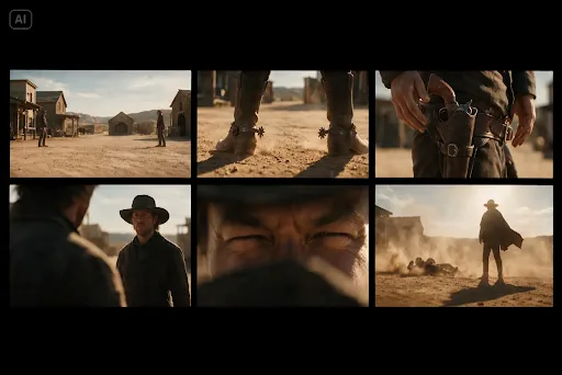
A good series poster can make you curious before you know a character’s name. It might be an empty room, a familiar street seen from an unusual angle, or an object that suddenly feels significant. For an independent creator, finding that image can be an exciting way to explore what a story feels like beyond the script.
An ai image generator can help turn an early visual idea into a concept image, even before a production has a cast or finished footage. But a memorable poster begins with a storytelling decision: what should a viewer feel, notice or wonder about first?
Find the promise at the centre of the story
Before choosing colours or a typeface, describe what kind of experience your series offers. Is it a tense mystery with a quiet setting? A warm comedy about neighbours who cannot leave each other alone? A science-fiction story that treats an extraordinary event as part of ordinary life?
Imagine an original fictional series about a night-shift radio host who begins receiving calls from a town that does not appear on any map. A concept poster could show a lonely microphone in a studio, a map with an unexplained blank space, or a distant light beyond a rain-covered window. Each image draws attention to a different part of the premise.
Write a one-sentence creative brief before generating anything: “A quiet, unsettling mystery about a radio host and a place that may not exist.” This gives the image a job. It does not have to explain every episode; it should invite the viewer into the right kind of story.
Tone matters as much as subject. A bright, playful image of a microphone might suggest a workplace comedy. A dark studio with a single illuminated switch may suggest suspense. Neither is inherently better, but one may be more faithful to the series you want to make.
Pick a visual anchor instead of showing everything
A script can contain a large cast, multiple locations and years of backstory. A poster has much less space. Choose one visual element that carries the idea: an object, a place, a silhouette or a relationship between two things.
For the radio-host concept, the microphone is a clear starting point. But the image becomes more distinctive when it also suggests the mystery: perhaps an illuminated call button sits beside a handwritten map, or a studio window looks out over an unexpectedly empty town.
Think about what the viewer can understand without an explanation. A detail that is meaningful only after the finale may not work as the central image for someone encountering the project for the first time. On the other hand, a hint can be intriguing without revealing its answer.
The visual anchor should also leave space for practical information. If the most important element fills the whole frame, there may be nowhere for the title to sit. Build the composition around both the image and the words you will add later.
Make three different creative directions
Instead of generating many slight variations of the same poster, compare a few genuinely different interpretations of the series.
The first could be object-led: a close view of a microphone and a glowing call button in a dark studio. This makes the radio premise immediately visible.
The second could be place-led: an isolated broadcast building at the edge of a foggy town, with one lit window. This emphasises atmosphere and location, although it may need a tagline to make the radio connection clear.
The third could be more abstract: a paper map with a blank area and the shadow of a radio aerial crossing it. This suggests the missing place while leaving more for the viewer to interpret.
Ask what each version communicates before reading the title. Does the genre come through? Is there a question that makes you curious? Could the image belong to almost any story, or does it contain a detail specific to this one? The strongest option is not necessarily the busiest or most dramatic.
Write a prompt that describes the image, not the plot
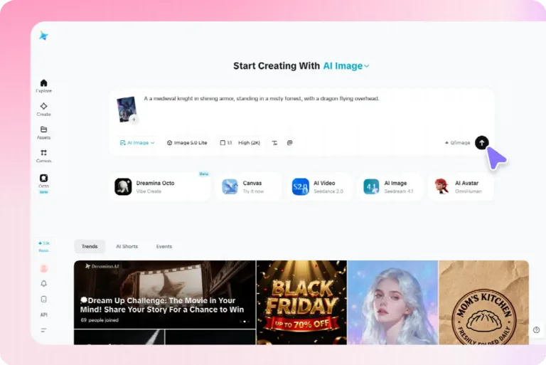
An image prompt works best when it focuses on what should appear in the frame. A paragraph of plot history may help you understand the story, but the generator also needs a subject, composition, lighting and visual mood.
For the object-led direction, you might write: “Concept poster image for an original mystery series. A vintage radio microphone on a desk in an empty night-time studio, one small call button glowing red, rain on the window, deep blue and muted amber light, cinematic but restrained, vertical composition, clear dark space at the top for a separate title, no lettering or logos.”
This prompt describes one possible image. It also leaves room for the design work that follows. If the result feels too much like a horror poster, try changing the lighting or mood rather than adding more plot. If the microphone is hard to recognise at a small size, ask for a clearer subject and simpler background.
Dreamina can generate images from a written description and can use an authorised reference image to guide a visual direction. An independent creator might use it to explore the three directions before selecting one for a pitch or discussing the concept with a designer.
Generated details can change between attempts. A microphone may gain unusual controls or a room may shift its layout. Compare the output with your brief and treat it as exploratory concept art, not a final production record.
Leave the title and credits for the design stage
A poster often needs a title, tagline and other information. Generated lettering can be inconsistent or misspelled, and the details of an independent project may change as it develops. Add important words as editable text in a design tool rather than relying on the generated image to spell them correctly.
Start with a clear hierarchy. The title should be easy to find; a short tagline can provide context; additional information should not overwhelm the image. If the concept is for an early pitch, consider whether you need credits at all. Never invent a cast member, distributor, release date or production partnership to make the concept look more complete.
Try the design at the size viewers will actually encounter it. A title that looks elegant on a large monitor may disappear in a small thumbnail. If the text competes with a busy background, use a quieter part of the image or adjust the layout instead of making the letters smaller.
Also review the image for accidental text and logos. The prompt can ask for none, but the result still needs a human check. Replace or revise a visual if an unintended mark could confuse viewers or resemble another brand.
Use the concept in a pitch without overstating it
An early poster can help collaborators discuss the tone of a project. A writer may use it to show a director how a setting feels, or a small team may compare visual approaches before preparing a more complete pitch deck.
Label the image clearly as concept art. If the project has not been commissioned, cast or produced, the presentation should not imply otherwise. A concept image can illustrate your intended atmosphere; it is not evidence that a set has been built or that footage exists.
When asking for feedback, give the viewer the short premise and then show the image. Useful questions include: “What genre would you expect?” “What detail catches your attention?” and “What question does this image raise?” Listen for a mismatch between the story you intend and the impression the poster creates.
A collaborator may notice a direction you had not considered. The place-led image might be more mysterious, for example, but the object-led version might communicate the radio premise more clearly. That feedback helps refine the creative brief; it does not prove that a future audience will watch the series.
Keep the story original and the materials authorised
Entertainment audiences are used to familiar actors, franchises and visual styles, which can make imitation tempting. For an original project, build the concept around your own story rather than asking for a specific performer’s likeness or presenting a generated image as artwork from an existing production.
If you use a photograph, illustration, logo or other image as a reference, make sure you have permission to upload and adapt it for the intended use. The same applies to material provided by a collaborator. Check the generation service’s current terms and any applicable model conditions, particularly if you intend to use the output commercially.
Generated images should not be presented as official posters for an existing film or show when they are not. If you share an unofficial interpretation or concept publicly, provide clear context and respect the rights associated with the underlying work.
Consider privacy too. A draft script, a location photograph or an unpublished design may contain information the team has not agreed to share. Use a general description where possible and discuss uploads with the relevant collaborators.
Review the whole poster, not just the image
When a concept begins to feel promising, step back and inspect the finished layout. Does the image support the premise? Can someone read the title quickly? Is the important detail still visible when the poster is reduced to thumbnail size?
Check the visual for inconsistencies. Objects may be distorted, lighting may behave strangely, and accidental letters may appear on screens or labels. Some imperfections may be acceptable in a clearly labelled internal concept; others could distract from a pitch or create a misleading impression.
Show the draft to someone who has not read the script. Ask what they think the story might be about before you explain. Their interpretation is not a verdict on the project, but it can reveal whether the image communicates the tone you intended.
Then make one decision at a time. If people do not notice the radio, simplify the scene. If the image suggests a different genre, reconsider the colour and lighting. If the title is hard to read, adjust its position or background. The goal is to make the story clearer, not simply to add more detail.
Give viewers a reason to look twice
A concept poster is a small window into a larger story. It does not have to reveal the ending, imitate a studio campaign or make an unfinished project look complete.
Begin with the feeling at the centre of the series, choose one visual that expresses it, and leave room for the viewer’s curiosity. A well-chosen image can start a creative conversation long before the first episode reaches a screen.

Thomas Miller is the founder and Editor-in-Chief of Seat42F, covering television, movies and streaming entertainment. He launched Seat42F in 2007 and has spent nearly two decades covering the entertainment industry.